.svg)
.png)
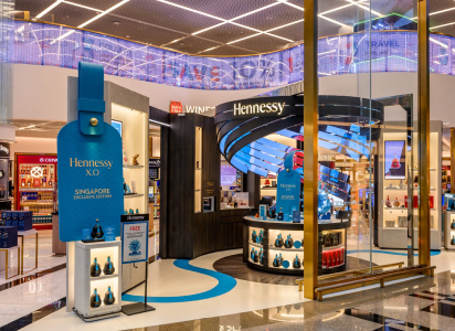
In early March 2026, Campari Group confirmed a global packaging refresh for Aperol that keeps the liquid unchanged but modernizes the bottle’s physical and graphic system - with rollout starting this month across on-trade and off-trade.
The design update is not a tweak - it reassigns what does the “work” at shelf and at bar. The bottle moves toward a more sculpted silhouette (the brand describes it as inspired by Italian architecture), adds rippled glass at the shoulder to draw the eye toward the orange liquid, and shifts to a smaller, more minimal front label so the liquid becomes the hero asset.
On the back, the bottle now carries a transparent label that doubles as a built-in service guide for making an Aperol Spritz. This choice is subtle but strategic - it turns packaging into a lightweight training tool and a ritual reminder, not just a compliance label.
A final heritage cue is now literally cast into the product experience. The bottle includes an embossed monogram honoring the brand’s founders - a provenance mark meant to signal continuity and craftsmanship in-hand.
Packaging redesigns are easiest to dismiss as cosmetics - until you look at the current operating context for global spirits. In March 2026 financial coverage, Reuters reported that Campari’s organic revenues rose 2.4% in 2025 amid an industry slowdown, while still navigating tariff pressure and a complex operating backdrop.
Those topline results are also paired with a clear signal that the company is investing and prioritizing. In the 2025 full-year results press release, Campari reported net sales of €3,051 million (+2.4% organically), EBIT-adjusted of €637 million (+5.4% organically), and noted that profitability benefited from gross margin accretion despite the impact of US tariffs, alongside ongoing cost containment and a “step-up” in advertising and promotion spending.
Leadership language matters here. In that same results communication, Simon Hunt positioned the strategy around sustained momentum and brand building, and United States tariffs were explicitly called out as a headwind the group is planning around (rather than using as a reason to pause).
In other words: this is the kind of environment where packaging has to earn its place as a performance lever. When volume is harder to win, brand owners typically sharpen a few big, distinctive assets and push them everywhere - bars, retail shelves, and the digital shelf - because that’s where conversion happens. The stated rollout path (on-trade and off-trade, starting now) fits that playbook.
From a marketing leader viewpoint, Aperol’s update is less about “new look” and more about reallocating equity from the label to the object itself.
Color becomes the primary billboard. The visual system increasingly relies on the orange liquid as the distinctive asset, with the brand explicitly shrinking the front label to give color more dominance. That is consistent with how packaging design research treats color and visual attention as decision drivers - when packaging increases the probability of being noticed, it increases the probability of being chosen.
Texture becomes a premium cue and a reason to pick up. The new rippled shoulder is not only visible - it is also a tactile prompt, and (for bottled spirits) touch is often the difference between “noticed” and “considered.” In a 2025 study release by Sappi North America in collaboration with Clemson University, the authors frame tactile packaging as a measurable driver of purchase likelihood and emotional response, with quantitative findings tied to touch frequency and conversion.
Heritage is embedded, not narrated. The embossed monogram is a smart heritage move because it functions whether or not a consumer reads any copy. It also connects cleanly to a true brand milestone: Aperol was created by the Barbieri brothers and launched in 1919 at the Padua International Fair.
That heritage-to-modernity bridge also maps to the brand’s ownership story. Campari’s acquisition of Barbero 1891 in 2003 (with Aperol among the main brands) is explicitly documented in the company’s own transaction press release, including an enterprise consideration of €150 million.
If you are a CMO or founder looking for the transferable lesson, it is this: the most scalable packaging refreshes protect recognizability by keeping the core semiotics intact (here: the orange liquid, the ritual, the Italian provenance halo) while relocating distinctiveness into structural design that survives in low-attention environments (crowded shelves, bar backlines, and thumbnail images).
On-trade: packaging becomes a silent bartender. The transparent back label with a Spritz guide is a small detail with outsized operational implications. It lowers friction for trial (especially in casual home entertaining) and reinforces standardization when the serve ritual is central to the brand experience. This aligns with the way both the brand and the broader cocktail community codify the Spritz spec - for example, the IBA’s ingredient list and method, and Aperol’s own recipe guidance that follows the 3-2-1 ratio and presents the drink as IBA-approved.
Off-trade: the bottle is engineered for shelf competition. If you accept the core finding from eye-tracking research that visual attention strongly predicts purchase in real supermarkets, then the redesign’s “attention hooks” (rippled shoulder, refined silhouette, more liquid visibility) are not aesthetic flourishes - they’re conversion hypotheses.
Digital shelf: fewer label details can be an advantage. At thumbnail size, intricate label systems often collapse into noise. A bottle that reads through silhouette and a block of distinctive color is easier to recognize in carousel views and search grids. Aperol’s approach - shrinking the label to foreground the orange liquid - is effectively a digital-first move disguised as a physical redesign.
Portfolio signaling: “one redesign” rarely stays one redesign. Multiple trade reports frame the Aperol redesign as part of a broader packaging update across Campari Group’s portfolio, referencing additional refreshed designs for brands such as Campari, Courvoisier, Wild Turkey and Espolòn. Even if each brand’s execution differs, coordinated packaging modernization is typically about making the portfolio feel contemporary as a system - especially important when leadership is prioritizing “fewer bigger bets” and brand building.
A key caution for operators: new glass shapes and textures are rarely cost-neutral. Even when the intent is premiumization, leaders should pressure-test supply risk (glass sourcing, line speed, breakage rates, secondary packaging fit, case efficiency) and ensure the redesign does not create friction in fast-paced on-trade storage or backbar handling. These are not criticisms of Aperol’s design - they’re the predictable execution risks that separate an award-winning pack from a business-winning pack.
The Spritz is not a single-brand category, even if Aperol often acts like the category shorthand. International Bartenders Association explicitly notes that there are other versions of the Spritz that use Campari, Cynar or Select instead of Aperol.
That matters for packaging because it reframes the competitive set. Aperol is not only battling “other aperitifs” - it’s battling alternative ritual owners. When a consumer can swap the bitter component and still call the drink a spritz, the brand that owns the most frictionless ritual cues (visual distinctiveness, easy “how-to,” and bar-friendly recognizability) has an advantage.
It is also worth zooming out to Campari Group’s broader design behavior, because it signals organizational conviction that packaging is strategic. The group has previously refreshed the Campari bottle with a design positioned as a homage to Milan and an evolution of the brand’s design language.
Even deeper in the portfolio, Campari Group’s owned history treats packaging as part of the iconography. On its brand pages, Campari describes Campari Soda’s signature bottle as designed in the 1930s by Fortunato Depero and still an icon of Italian aperitivo culture - a reminder that the company has long viewed the container as part of the asset, not a wrapper around it.
In that context, Aperol’s 2026 redesign reads as a disciplined move, not a reinvention: preserve the instantly recognizable orange, modernize the bottle as an object, and bake the serve ritual into the pack so the brand is easier to execute everywhere.
If you are assessing this redesign as a brand leader, the goal is not to “launch a new bottle.” The goal is to gain incremental availability, attention, and ritual adoption without losing recognition.
A practical scorecard can be built without waiting a year for syndicated data:
Shelf and bar recognition Measure unaided recognition at distance (2m, 1m, arm’s length) with the bottle facing both front and at 45 degrees. The design changes are explicitly meant to elevate presence across bars, terraces, and retail shelves - so measure that claim in the environments where it must win.
Attention and conversion diagnostics Use rapid shelf tests or mobile eye-tracking in real or simulated retail to see whether the new silhouette and rippled shoulder increase time-to-first-fixation and total gaze time. This is grounded in published findings that visual attention is a key predictor of purchase, even after controlling for other factors.
Pick-up and in-hand persuasion Treat touch as a quantified KPI, not a vibe check. If a tactile feature is introduced to make the bottle “feel special,” then track pick-up rate, dwell time in hand, and conversion among shoppers who handle the bottle. Research commercialization in this space explicitly links tactile engagement to purchase likelihood and product choice.
Ritual adoption Because the redesign includes a Spritz guide on the back label, you can directly measure whether that reduces recipe variance and increases at-home compliance: post-purchase surveys, UGC analysis of pour ratios, and bartenders’ reported serve consistency. The brand is explicitly tying the package to the ritual.
Execution and margin reality checks Track packaging-related cost deltas and operational impacts alongside brand KPIs: packaging COGS, line efficiency, damages, and retailer planogram compliance. This matters more in 2026 because tariff impacts and cost containment are part of the group’s stated operating reality, even as the company emphasizes continued brand investment.
The core takeaway for alcohol brand owners and C-suite marketing leaders is not “Aperol has a new bottle.” It’s that the brand is treating packaging as a modern growth surface - one that simultaneously carries distinctive assets (color), premium cues (texture), and ritual instruction (Spritz guidance), while being deployed at scale across on-trade and off-trade at a moment when disciplined brand building is the stated corporate priority.
.svg)
Industry intel in your inbox — from major headlines to expert insights, stay ahead in the business of alcohol.

.png)
.png)
.png)
.png)
.png)
.png)
.png)